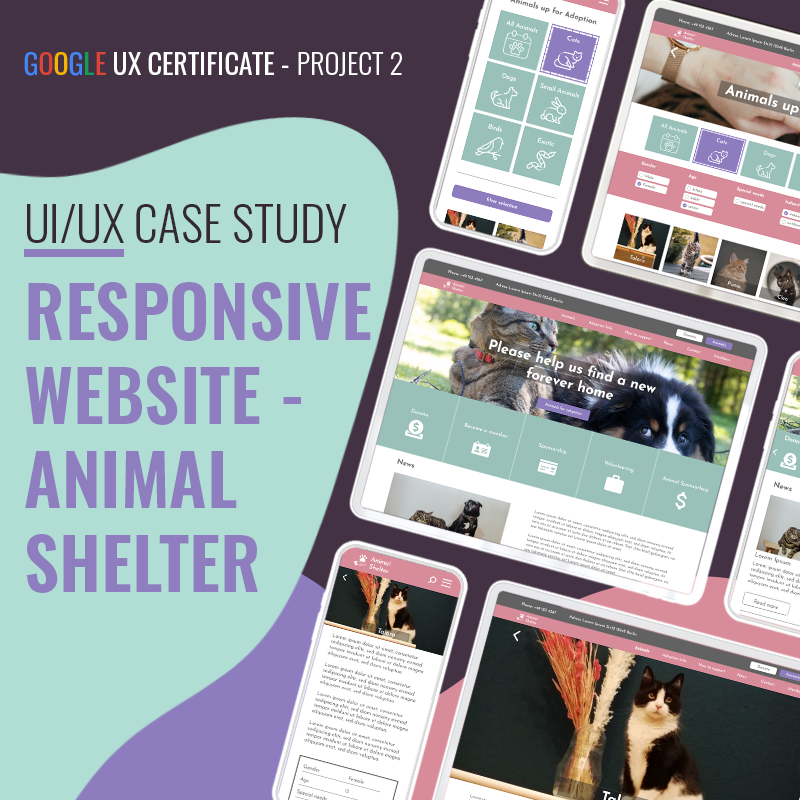
Animal Shelter Website
Animal Shelter Website
Google UX Certificate Project 2
———————————————
The Animal Shelter Website is a responsive website for mobile and PC. The website shall help users find adoptable animals more easily and give them the opportunity to book appointments for visiting them online.
Role/Responsibilities
My role was UI/UX designer, designing a responsive website for an animal shelter, from concepting to user testing, to high fidelity prototype. I focused on the creation and testing of the process of sending an inquiry for a desired animal.
Problem Statement
Users want to find information about adoptable animals of their local shelter online and they want to send an interest inquiry online as well. Many shelters do not have enough or updated information about their animals. Thus people usually need to visit the shelter and are potentially disappointed if no fitting animal is available.
Goals
Help a wider audience in finding a fitting animal from their local shelter.
Video for the final PC Prototype
Design Process
I conducted interviews and created a persona, problem statement and a user story based on my research, as to better empathize with the target audience.
I discovered that the main audience was mostly interested to find the current information about adoptable animals and information about the adoption process online. They also want to be able to filter animals based on their needs and additional features. Furthermore, it would be useful to request an appointment for visiting a fitting animal.
In the ideation phase I started with an competitve audit to make informed decisions about what to include in my website. I made a sitemap to help me structuring all the information that needs to be available on the website and based on that created wireframes to test the user flow of booking an appointment to visit an animal.
Sitemap
Mockup Desktop Wireframes
The usability study was an unmoderated study with 3 participants, which took about 10 min for participants, including the test of the LoFi prototype and subsequent questions about the experience.
Some findings:
- All testers confirmed that they deem the possibility to book an appointment online for the first visit for animals that they are interested in, useful
- 2 participants felt positive using the website, 1 confident
- 1 participant could not find the filter selection on the mobile version
- The navigation was clear for all testers
Accesibility Considerations
- The highlight buttons for animals have a different color than unhighlighted buttons and a border to easier distinguish between the different states, especially for people with color blindness.
- I put a strong emphasis on big icons with text for easier navigation.
Results
The users were pleased with the navigation and filtering features. They found the overall structure easy to understand and not overwhelming.
Mockup final Desktop Hi-fi Screens
Prototype for PC
Mockup final Smartphone Hi-fi Screens.
Prototype for Smartphone
What I learned
I deepened my UX skills and learned how to plan for a responsive website. This site needs to communicate a lot of information to the user. The challenge was to create a site with a lot of information without being too overwhelming. For this it helped to learn about sitemaps and applying them to get an overview about necessary pages and how they are linked before getting into the sketching phase.


